BritBox, reimagined
I audited BritBox screen by screen, studied why people prefer Netflix, and rebuilt the experience around getting viewers to their shows faster, with a look only a British service could own.
- Role
- Sole designer: research, UX, visual system, prototype
- Context
- CSUF course 483F, unaffiliated with BritBox
- Tools
- Figma, Claude (code rebuild)
- Deliverable
- Interactive desktop and TV-search prototype
Drag to compare
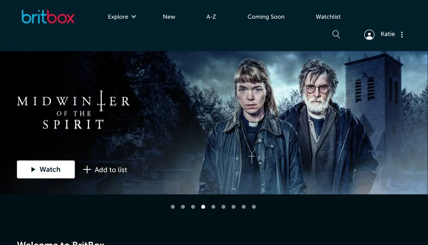
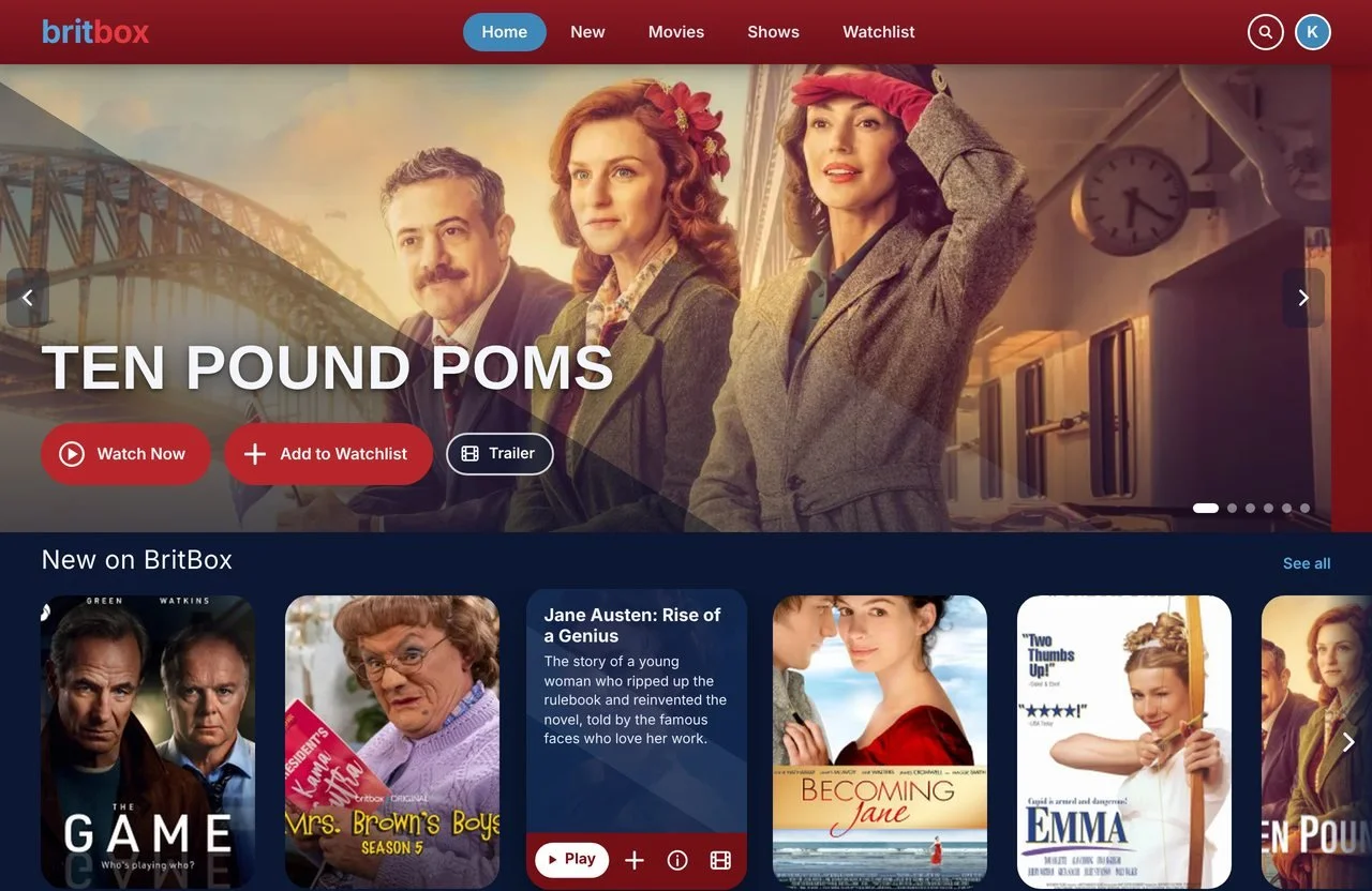 BeforeAfter
What worked, and what needed to change
I screenshotted BritBox end to end. Pick a screen to see what I kept and what I changed, and why.
What Netflix and Prime taught me
I asked students around campus which streaming service they use and what makes it different. Most picked Netflix, so I studied how Netflix frames its shows and compared it with Prime Video.
People don't remember features. They remember how easy it is to get back to their show and decide what to watch next.
Netflix and Prime Video details from Netflix Help, Pratt IxD critique, Tubefilter, TheWrap and Amazon Ads. Both services test layouts often, so details vary by account.
Four changes that matter most
Your shows come first
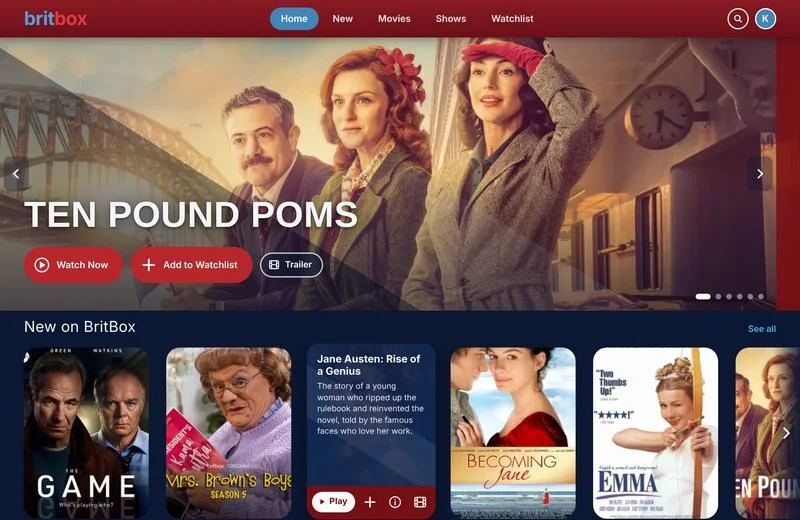
BritBox opened with a generic “Welcome to BritBox” row, kept your Watchlist on its own page and hid genres in a menu. Netflix and Prime both keep Continue Watching near the top, so I did too.
BritBox today
My redesign
Five clear destinations
Explore, New, A–Z and Coming Soon all answered the same question: what can I watch? Overlapping choices slow people down. Each item now goes somewhere different, like Netflix's short top bar.
- A–Z became a sort on the Shows page
- Coming Soon moved into the New page
- Genres moved onto the home page, each opening its shows and films together
Decide without leaving the row
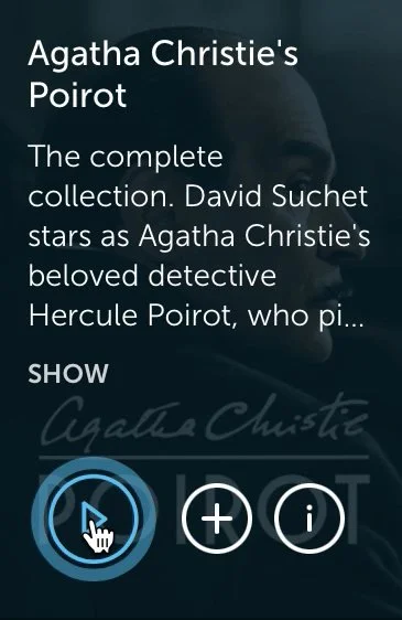
BritBox's hover card hid the artwork, cut the synopsis mid-sentence and offered three unlabeled icons. Mine shows the full description, a labelled Play button and three icon actions with tooltips. Trailers play only when you ask, unlike Netflix and Prime's autoplay.
Hover the card on the right to try it.
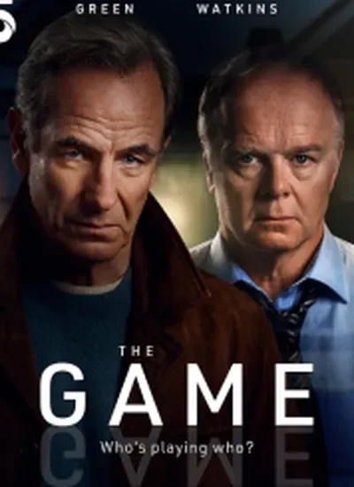
The Game
Haunted by an unsolved case, a retired detective’s peace is shattered when his new neighbour repeats a killer’s chilling phrase.
Search that fits the screen
BritBox's search covered the whole page and hid what you were browsing. On desktop, search is now a bar in the header with a dropdown of results that you close with the X, so you never leave the page. On a TV, where you type with a remote, the keyboard sits on the left so matches appear beside it as you type.
A full-screen overlay with small, faint browse links.
A header bar with a results dropdown. Close it with the X; the page stays put.
On-screen keyboard on the side, results updating beside it.
Giving it a British look
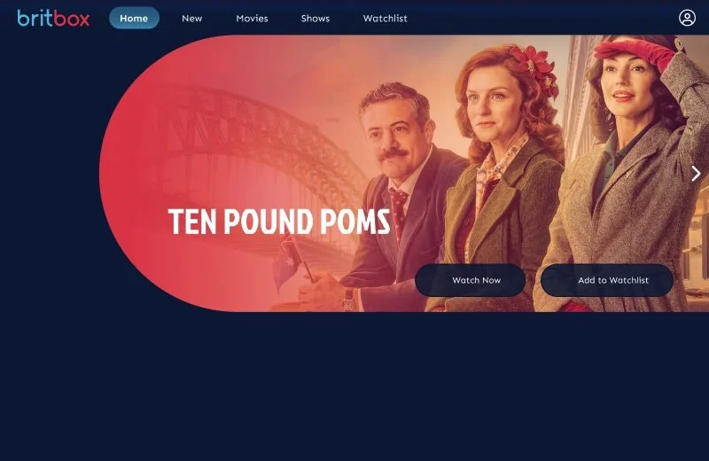
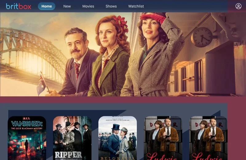
My first pass solved the UX on a plain blue background. In critique, my professor pushed me to think about design as much as UX, so I turned the Union Jack's diagonal into the layout and used the logo's own red and blue.
I designed it in Figma. Claude built it, and I decided what stayed.
The audit, research and visual design were mine. I used Claude for two jobs I couldn’t do alone: turning my Figma prototype into working code, and checking the result against established usability rules.
What I asked
Rebuild my Figma screens as a prototype that runs in a browser.
What came back
A working build that exposed ten problems my Figma file had hidden, such as rows cut off with no way to scroll and a menu that led nowhere.
Where I pushed back
The first build worked but felt busy. I asked Claude to review it against Nielsen’s ten heuristics, then cut eight things, including a carousel that moved on its own and three different routes to the same genre list.
What it changed
I tested something real instead of a click-through. The Original / After review toggle below shows both versions.
Try the redesign
I rebuilt my Figma prototype in code with Claude so it runs right here, and fixed the bugs I found along the way.
Fixed from the Figma version
- Wrong hero title. The Pride and Prejudice slide was labeled "Ten Pound Poms".
- Rows cut off. Rows ran past the screen with no way to see the rest; they now scroll, with arrows.
- Copy-paste synopsis. Grace reused Vanished's description.
- Duplicate labels. Two Continue Watching cards were both "Trigger Point".
- Overflowing text. Long synopses ran into the button bar.
- Naming. Fixed "Jane Austin" and retitled the Poirot card.
- Missing arrows. The Inspector Morse slide had no carousel controls.
- Keyboard and touch. Hover cards now open on focus and on tap.
- Dead-end menu. Every nav item, search and the account menu now open a working page.
- Hero contrast. Lighter overlay so the art shows, and buttons that flip to white on hover.
Simplified after a heuristic review
The first build felt busy, so I checked it against Nielsen's 10 usability heuristics and NN/g's smart-TV research. Use the Original / After review toggle above to compare.
What I learned and what's next
What I learned
Auditing a real product taught me to separate what's broken from what just looks dated. Most of BritBox's problems were about order and hierarchy, not missing features. And critique showed me that brand is part of the experience, not a layer on top.
What I'd do next
This was validated through class critique and informal conversations. Next I'd test the new row order with real subscribers, design the show page, and take the TV layout beyond search to the full home screen.